
John outlining the text of our word on a homemade transparency

On our way down the elevator

I can't take a candid photograph

In the art room

Setting up

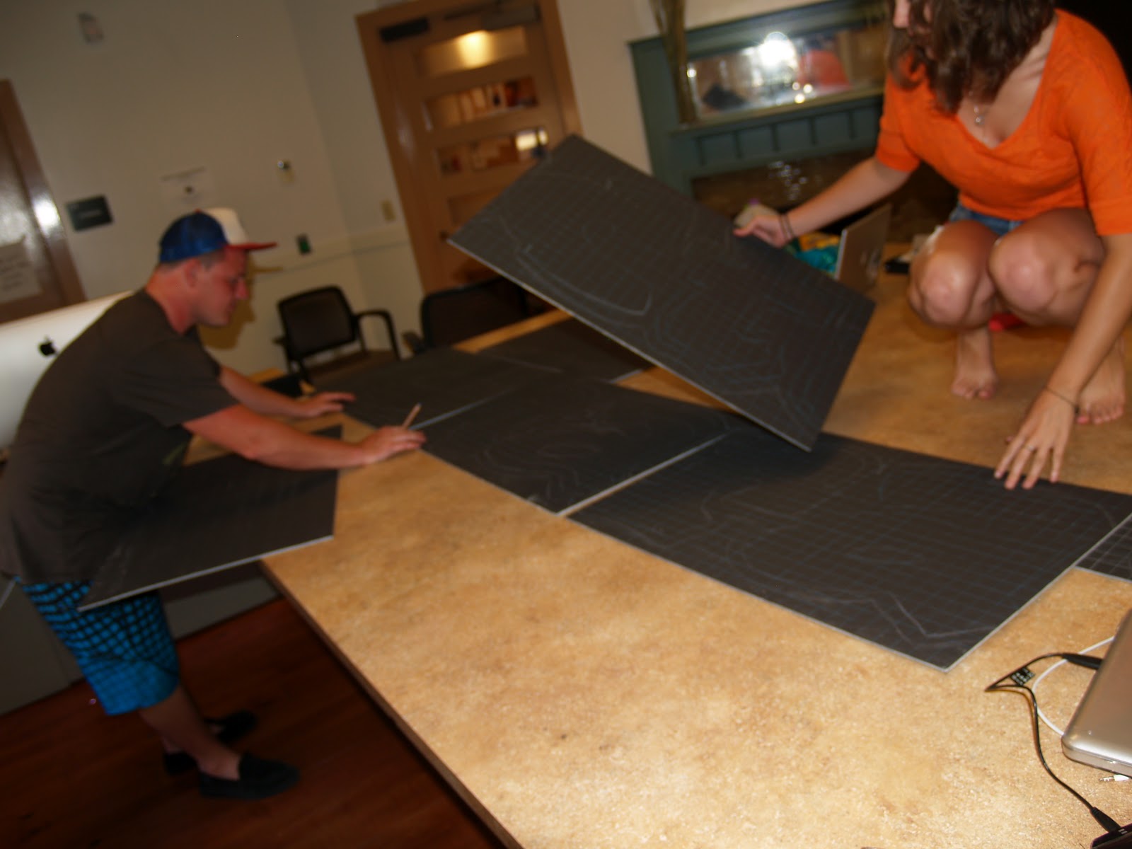
We have the word all written out on the foam core


Creating pixels


I finished my first one after John finished 2


I cannot make a straight line..


The paper in the flower-esque effect

He's havin a good time

And obviously hard at work

Supplies :)

At the beginning, everything pixeled and color cordinated


We added the blue to help contrast the other colors in the shape of the letter

It definitely looks better, no?

John had the first one finished. Looks awesome!

Hmm..


After day two

After day three


We finished by day four

Definitely one of the coolest things I've ever done

Have to share the success with everyone


Yay!

What a successful day :)
I shall post more after the Art Walk this Friday June 1, 2012
No comments:
Post a Comment