Click here to see my Portfolio blog! Instagram

Wednesday, May 30, 2012

Typography 10ft Word

In this project, I was paired up with John West in the making of a 10ft word that he and I felt described typography. Typography is thought to be a dying breed, but people are still creating varieties of different and new typefaces.  John and I felt that the word character best explained typography because, honestly, what is a typeface made of? Characters. The typographical definition of character is "A symbol in writing. A letter, punctuation mark or figure" thanks to http://www.proximasoftware.com/fontexpert/terms. Our chosen medium was tissue paper pasted on foam core board in a flower-esque effect.  This project will be displayed in front of the Mane de Leon salon on June 1st during my first Art Walk.  After approximately 26+hrs of work and $70 spent, this is what we came up with:
 John outlining the text of our word on a homemade transparency
 On our way down the elevator
 I can't take a candid photograph
 In the art room
 Setting up 
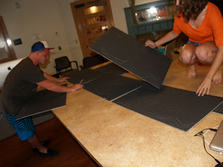
 We have the word all written out on the foam core

 Creating pixels 


I finished my first one after John finished 2 


 I cannot make a straight line..


 The paper in the flower-esque effect
 He's havin a good time
 And obviously hard at work
Supplies :)
 At the beginning, everything pixeled and color cordinated


 We added the blue to help contrast the other colors in the shape of the letter
 It definitely looks better, no?
 John had the first one finished. Looks awesome!
 Hmm..

 After day two
 After day three

 We finished by day four
 Definitely one of the coolest things I've ever done
 Have to share the success with everyone

 Yay!
 What a successful day :)

I shall post more after the Art Walk this Friday June 1, 2012

Saturday, May 19, 2012

Re-Made Queen

My first assignment for my Graphic Design I class was to choose a song, divide the song into six parts, and create images, whether by hand or of photographs with the lyrics of our song in it in some fashion. The lyrics, however, had to be handwritten..


My song of choice was "Don't Stop Me Now" by Queen. This will probably forever be one of my favorite songs.. I chose to use felt as my material, and stencils on white, dry erase board for the text.


And this is what I came up with:


And after everything was printed several times, cut out multiple times, and finally approved to be close to perfection, these were developed:

CD outside cover and CD

Inside CD 

Back of CD case

DVD case front

Inside DVD case with DVD and mini poster

Back of DVD case


A successful ending to a long day :)